
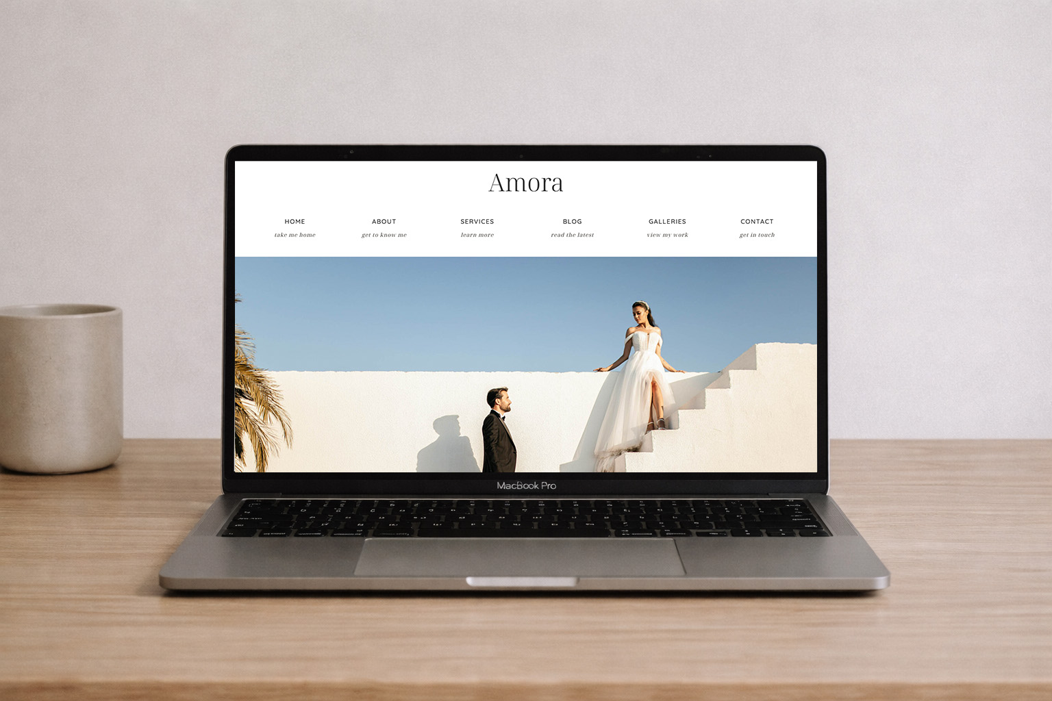
Optimizing Images For Your WordPress or Showit Site
Updated 2026 Guide to Optimizing Images for WordPress & Showit
Optimizing images isn’t just about smaller files anymore; it’s a performance, SEO, and user experience play that can impact everything from Google rankings to Core Web Vitals. Whether you’re interested in optimizing images for your WordPress or Showit site, let’s walk through why it matters and how to do it the right way today.
Why Image Optimization Still Matters in 2026
Fast, optimized images are about more than load speed — they can improve:
- Core Web Vitals, especially Largest Contentful Paint (LCP), often focus on the biggest image on your page.
- Search rankings are particularly affected by Google’s ongoing emphasis on performance metrics.
- User experience and engagement by reducing bounce rates.
- Bandwidth and storage usage are essential for blog media libraries.
In short, optimized images make your site faster, more user-friendly, and more competitive.
Standard Image Sizes for A Modern Day Website
What we use as standards for Showit and WordPress image optimization:
Horizontals: 2000 to 2400px on the long side at 72 DPI.
Verticals: 1000 to 1500px on the long side at 72 DPI.
Pro tip: If your site theme displays images at a maximum width of 1200–1400px, exporting larger than that only adds weight without benefit.
When dealing with horizontals, strive for a size of 2000 to 2400px on the long side at 72 DPI.
For verticals, target a range of 1000 to 1500px.
In Photoshop, you’ll want to edit with quality settings between 6-8, or Lightroom (utilizing compression ratios of 60-70%) can be the best for optimization.
The aim? Ensure your image file sizes stay below 400KB to keep your website loading swiftly and seamlessly!
Consistency in Crop Ratios
Consistency matters just as much as image quality. When your photos share the same crop ratios, your website instantly feels more polished, intentional, and professionally designed.
Whether you’re working with a traditional 4×6 photography ratio or opting for more web-friendly formats like 1:1, 3:2, or 16:9, the key is choosing a ratio and sticking with it across galleries, grids, and sections. Mixing crop styles within the same layout often leads to uneven spacing, awkward alignment, and unpredictable results across different screen sizes. With Showit’s latest updates, you can upload all images at a standard ratio and crop directly within Showit now!
Because every website builder and device handles images slightly differently, consistent crop ratios help prevent gallery issues and ensure your images display cleanly and correctly on desktop, tablet, and mobile alike.
DPI: What Actually Matters For The Web
For web images, DPI doesn’t affect how they display on a screen. Modern screens ignore DPI entirely and render images based on pixel dimensions rather than resolution settings.
That means whether an image is saved at 72 DPI or 300 DPI, it will appear the same size and quality online if the pixel dimensions are identical. DPI only becomes relevant when an image is printed.
If your goal is to discourage high-quality printing of web images, the most effective approach isn’t lowering DPI, it’s limiting pixel dimensions. Smaller pixel sizes don’t contain enough data to produce sharp, large prints, regardless of the DPI setting.
In short:
- Web images: Focus on pixel compression, rather than dpi. Web images should always be saved at 72dpi.
- Print images: Always save them at 300 dpi or higher to ensure the best print quality.
This approach keeps your site fast, your images sharp online, and your clients’ galleries protected from unintended print use.
Trim Unnecessary Metadata (EXIF Data)
Image files often contain hidden metadata, such as camera settings, lens information, and even location data, that adds unnecessary weight to your images without providing any benefit on the web.
When exporting images from tools like Lightroom or Photoshop, you can safely remove most EXIF data to reduce file size. In most cases, keeping copyright information only is more than sufficient for web use.
Stripping excess metadata helps streamline your images, improve load performance, and avoid sharing information visitors never see or need without affecting visual quality.
A Reliable Tool for Quick Image Compression
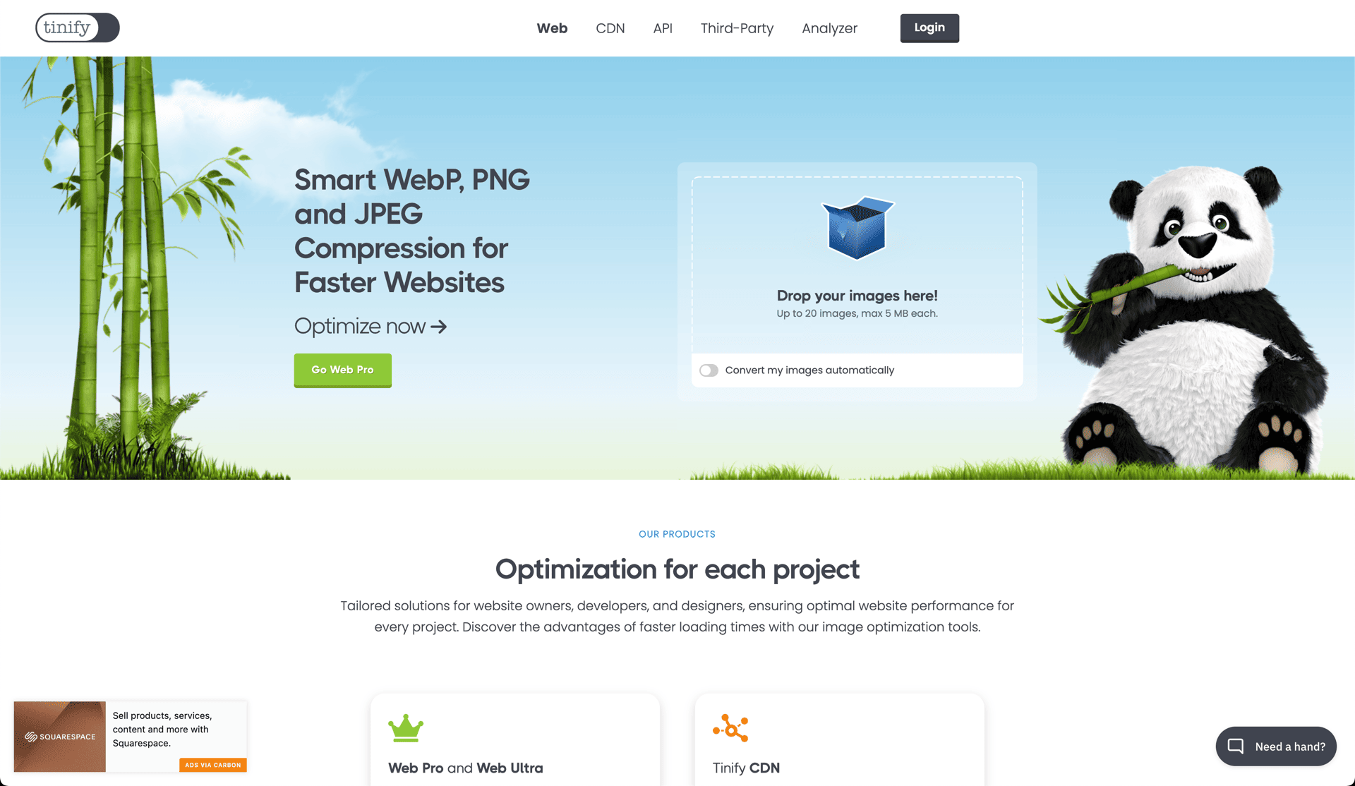
TinyJPG remains one of the most effective tools for quickly reducing image file sizes without noticeable quality loss. Its smart compression does an excellent job of balancing clarity and performance, making it ideal for everyday web use.
We regularly use TinyJPG for small batches of images when a fast, no setup solution is needed. For larger workflows, it also offers Photoshop plugins and API-based options that make bulk optimization more efficient. It’s a simple, dependable tool and still one of the best options available when you want strong compression with minimal effort. Drag and drop, let it do it’s thing and download, that’s it!
Why It All Matters
Speed matters. Even slight delays in page load time can have a measurable impact on user experience, engagement, and conversions. Image optimization is one of the simplest ways to improve performance without sacrificing design, and it’s often where the most significant gains are hiding.
By combining these techniques, proper sizing, modern formats, smart compression, consistent cropping, and clean exports, you can dramatically improve how your site loads and feels across all devices.
That’s the whole framework we use when optimizing images for WordPress and Showit sites. If you’ve ever struggled with slow pages, awkward galleries, or the challenge of using high-quality imagery without hurting performance, these strategies will help you strike the right balance between beauty and speed.
Sources on speed metrics: CloudFlare, HubSpot

